
Perfect Properties
by Invision
A responsive web app for small-scale property buyers looking for their first investment without the hassle.

Understand
-
The Problem Statement
Inexperienced property buyers need an efficient way to evaluate potential real estate investments with accessible, reliable, and comprehensive information.
We will know this to be true when we see users make informed decisions through intuitive search tools, personalized recommendations, and concise insights to help them find financial security.
-
The Hypothesis
The best possible solution for my users’ needs is a real estate app that small-scale buyers will use to make faster, more confident investment decisions.
By giving users the tools to reduce time spent searching, minimize confusion, and eliminate the need for constant professional assistance, users will find success in their property management experience.
-
The Vision
With responsive design and smart search technology, users will seamlessly explore a robust database of residential properties and land—whether at home or on the go.
Each listing will feature detailed information about the property and its surrounding neighborhood, enabling users to gain actionable insights and make confident investment decisions before scheduling an on-site visit.
Design Strategy
-
● Sign in, create user profile, and input property criteria
● Search and filter available properties
● Access comprehensive information about a given property and its neighborhood
● Bookmark a property listing
● Property recommendations feature
● Ability to contact real estate professional for more information or to schedule an in-person visit
-
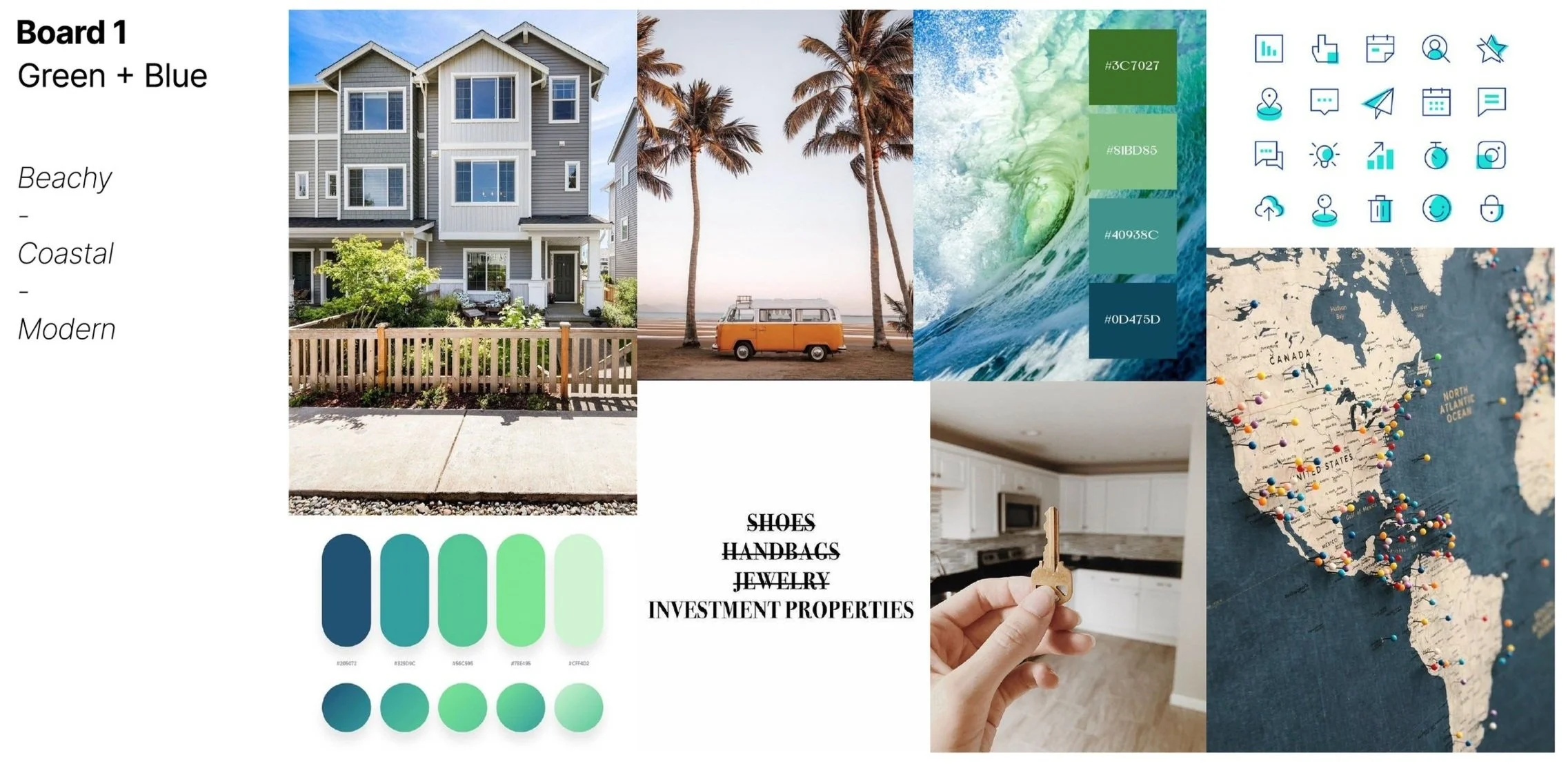
Quick, clean, and smart, our design features a refreshing focus on modern greens and calming blues that beautifully complement each other.
Analyze
-
Zillow & Redfin
Key User Features in Existing Apps:
Search & Filters: Both offer strong map-based search and filtering; Redfin excels in speed and real-time data.
Property Pages: Zillow is media-rich; Redfin is cleaner with better market insights.
Saved Listings & Alerts: Redfin’s alerts are more timely.
Mobile Experience: Redfin is more responsive and easier to navigate on mobile.
Weaknesses & Opportunities:
Cluttered UI (Zillow): Opportunity for a cleaner, simplified layout.
Data Delays (Zillow): Real-time listing updates could be a key differentiator.
Generic Experience: Personalization using AI could boost engagement.
Poor Collaboration Tools: Add shared shortlists, comments, or buyer chats.
Accessibility Issues: Design with accessibility in mind from the start.
Opportunity:
A new app can stand out with real-time data, a clean mobile-first UI, personalized search, and collaborative tools.
-
Research Summary
Participants:
12 (50/50 male and female, aged 18–65)
66.7% have invested in property, which 88.9% used online services in that process.88.3% would start with an online app over a realtor today.
Key Insights:
Top Apps Used: Zillow (83.3%), Redfin (41.7%)
50% bought property found through an app
Users value:
Ease of use and late-night browsing
Detailed filters and fast search
Neighborhood data (walkability, HOA, etc.)
In-app messaging
Most-Wanted Features:
Filters & Save: 91.7%
Messaging: 83.3%
Personalization: 41.7%
Key listing info (price, layout, size, photos): 100%
Action Plan:
1. Focus on Simplicity & Speed — Clean, mobile-first design that shows essential info at a glance
2. Prioritize Core Features — Real-time data, save + filter tools, and agent messaging
3. Differentiate with Smart Tools — Personalized recommendations, neighborhood insights, buyer collaboration features, and an accessible design
Bottom Line:
Users want fast, easy, and flexible tools for home shopping — a responsive app that merges Zillow’s depth with Redfin’s speed, and without the clutter.
User Persona
Rashida Jones
Rashida is a tech-savvy IT consultant who’s constantly on the move and relies on smart tools to manage her fast-paced life.
She’s looking to invest in property outside the city and needs an easy-to-use platform that delivers quick, relevant info to help her make confident decisions.
New to real estate but highly capable with tech, Rashida values efficiency, clarity, and the ability to browse and revisit listings on her own terms.
“I want to provide my family with financial security. I’ve been considering buying property for a while, and am looking for a tool that can help me find what I’m looking for, quickly!”
Ideate
-
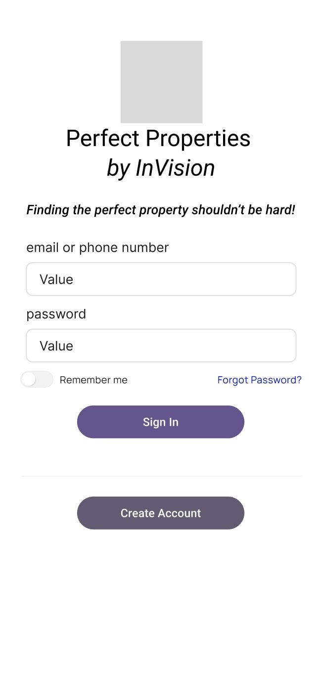
![]()
Low-Fi Onboarding
-
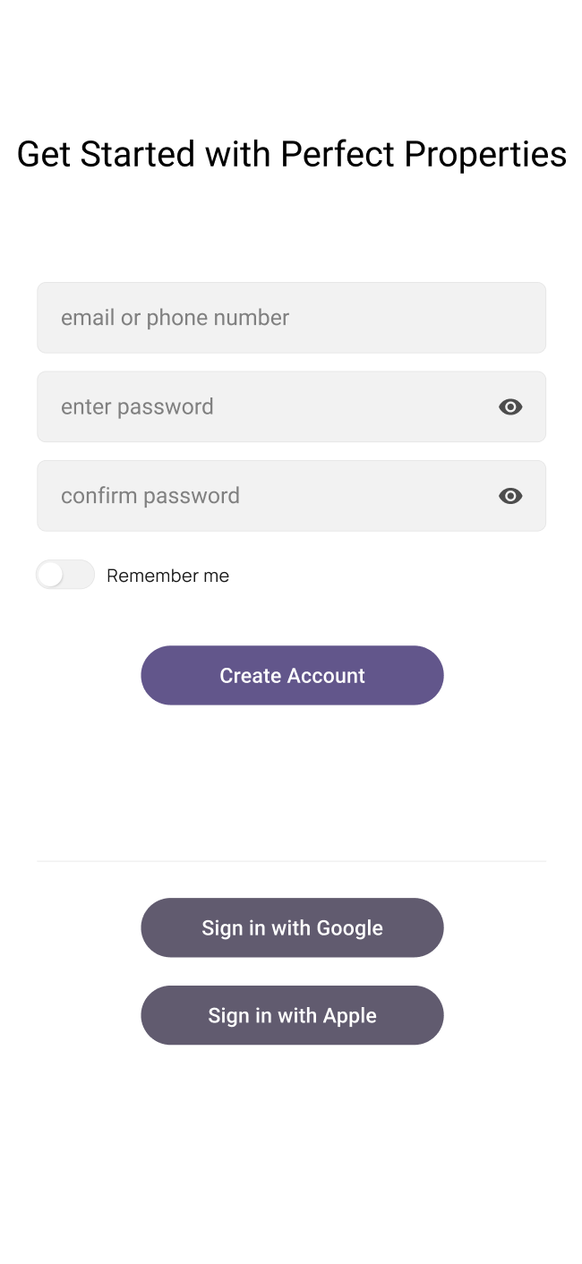
![]()
Low-Fi Create Account
-
![]()
Low-Fi Set Preferences
-
![]()
Low-Fi Dashboard
-
![]()
Low-Fi View Property
-
![]()
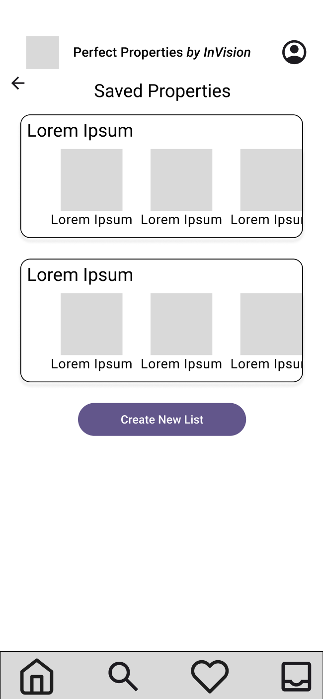
Low-Fi Saved Properties


Test Goals
To gain feedback on the initial layout and usability of Perfect Properties.
Understanding the Navigation
Users appreciated the flow through the app and found it easy to maneuver.
Low-Fidelity User Testing
Test Methods
Pre-test informational briefing
Unmoderated remote test
Post-test survey
Discovering Pain Points
One user noted feeling unsure about the “inbox” icon in the bottom right of the tab bar.
An “envelope” icon could be more familiar to users!
Test Demographics
4 participants
3 female, 1 male
Ages 28-64
Test Results
Additional Notes
Users appreciated the “heart” icon to save properties.
They were also glad they could create accounts using Google and Apple.
From Low-Fidelity to Mid-Fidelity
The changes implemented from the first round of ideation to the second were:
Swap the inbox icon for the letter icon to designate the messaging feature
Align and space each element for cleanliness and appropriate grouping
Add the “Search List” wireframe
-
![]()
Mid-Fi Onboarding
-
![]()
Mid-Fi Create Account
-
![]()
Mid-Fi Set Preferences
-
![]()
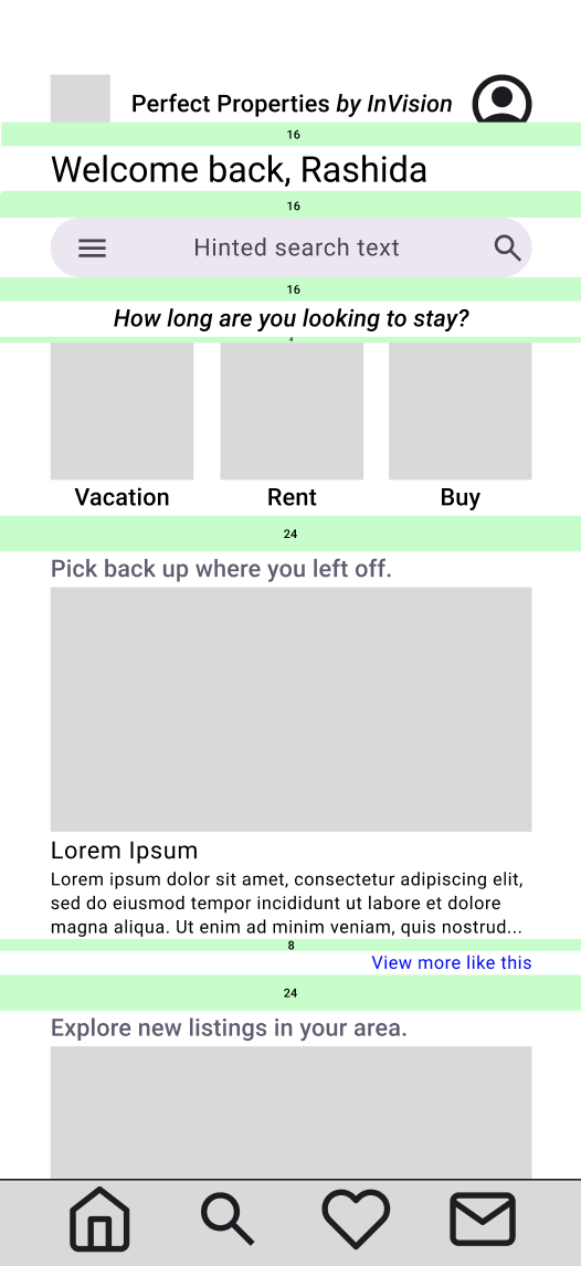
Mid-Fi Dashboard
-
![]()
Mid-Fi Search List
-
![]()
Mid-Fi View Property
-
![]()
Mid-Fi Saved Properties


Defining the Brand
As the project brief highlights the “who” as new, small-scale buyers, the target demographic will be young investors needing a clean, modern design to reach their goals.
My users rely on reliable, uncomplicated information to make the best choice possible, so calming greens and blues take the stress out of property hunting.
-
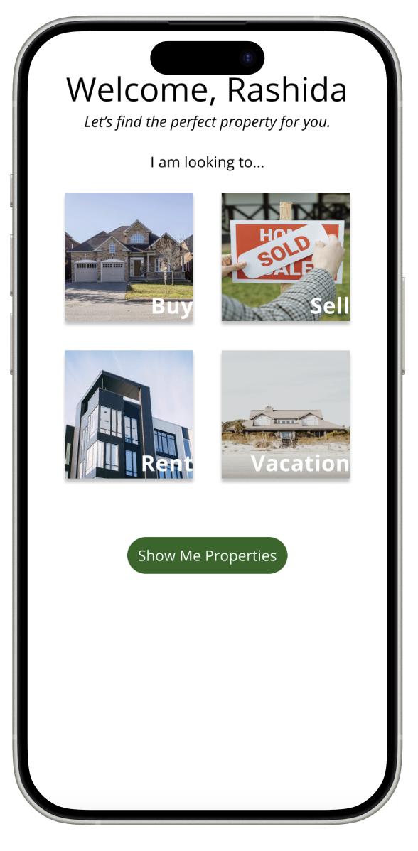
![]()
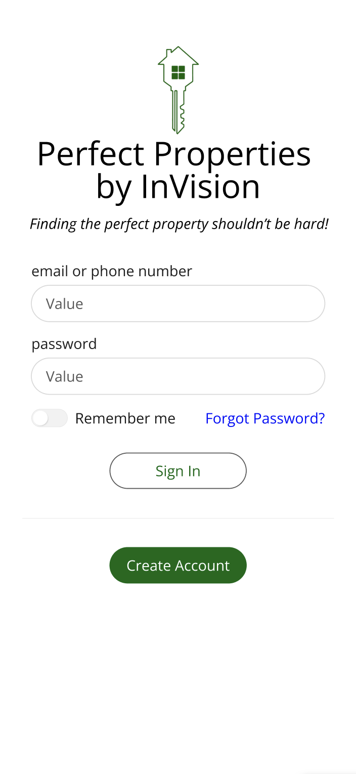
High-Fi Onboarding
-
![]()
High-Fi Create Account
-
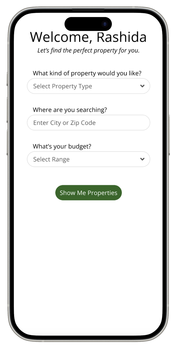
![]()
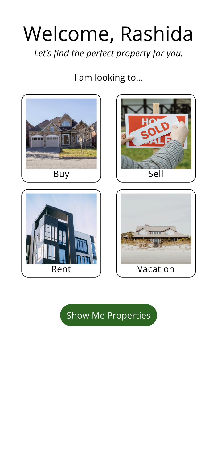
High-Fi Property Type
-
![]()
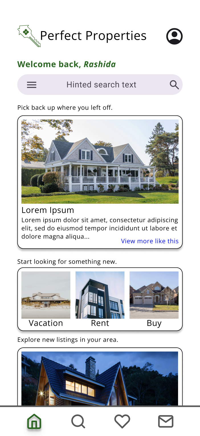
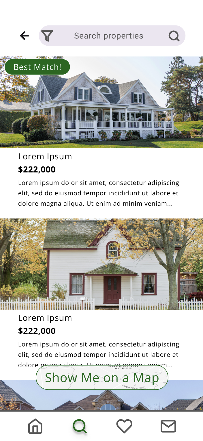
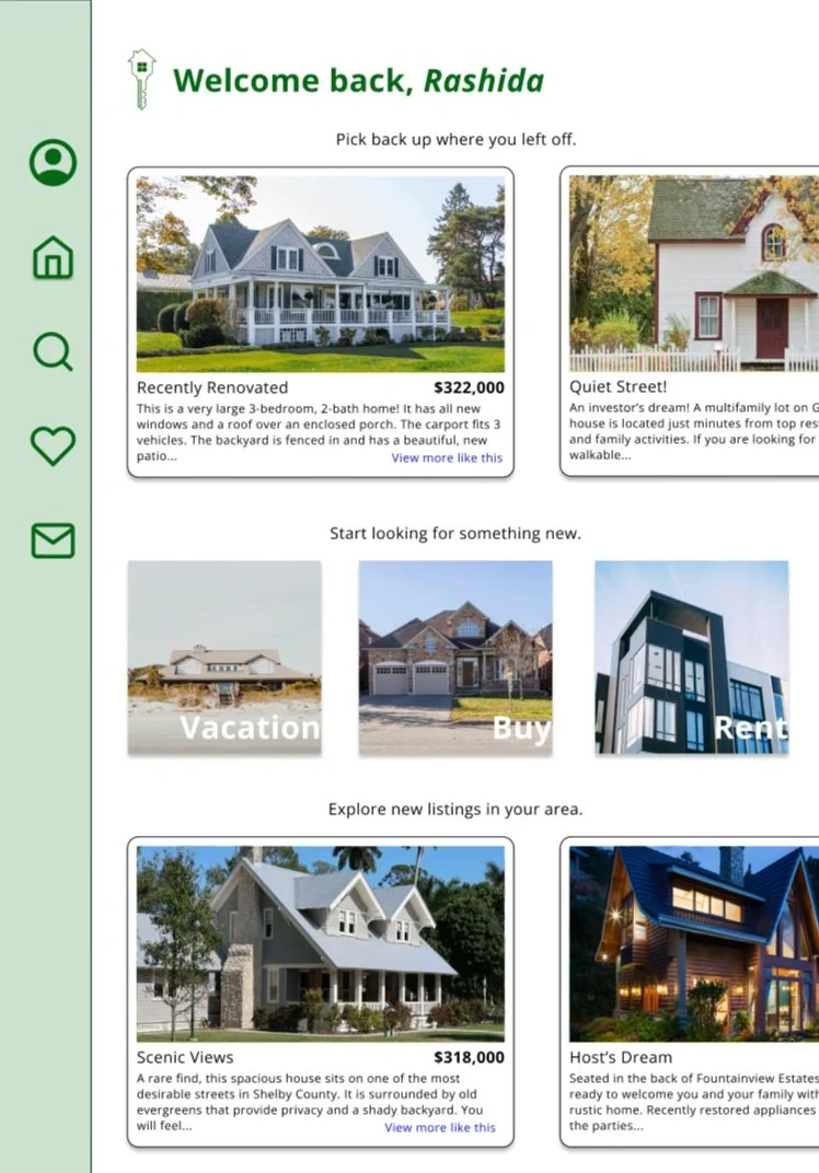
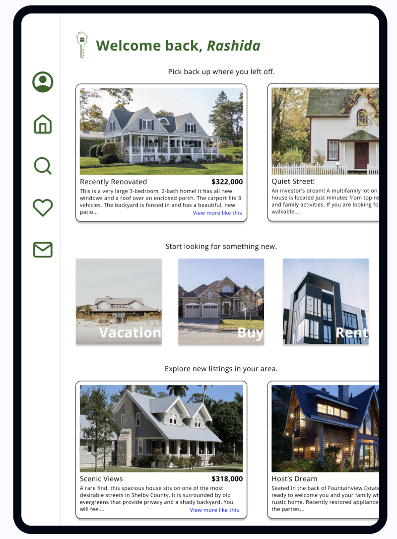
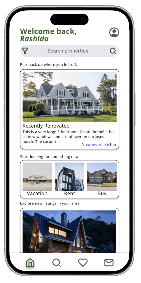
High-Fi Dashboard
-
![]()
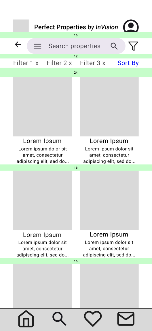
High-Fi Search List
-
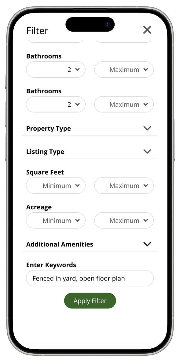
![]()
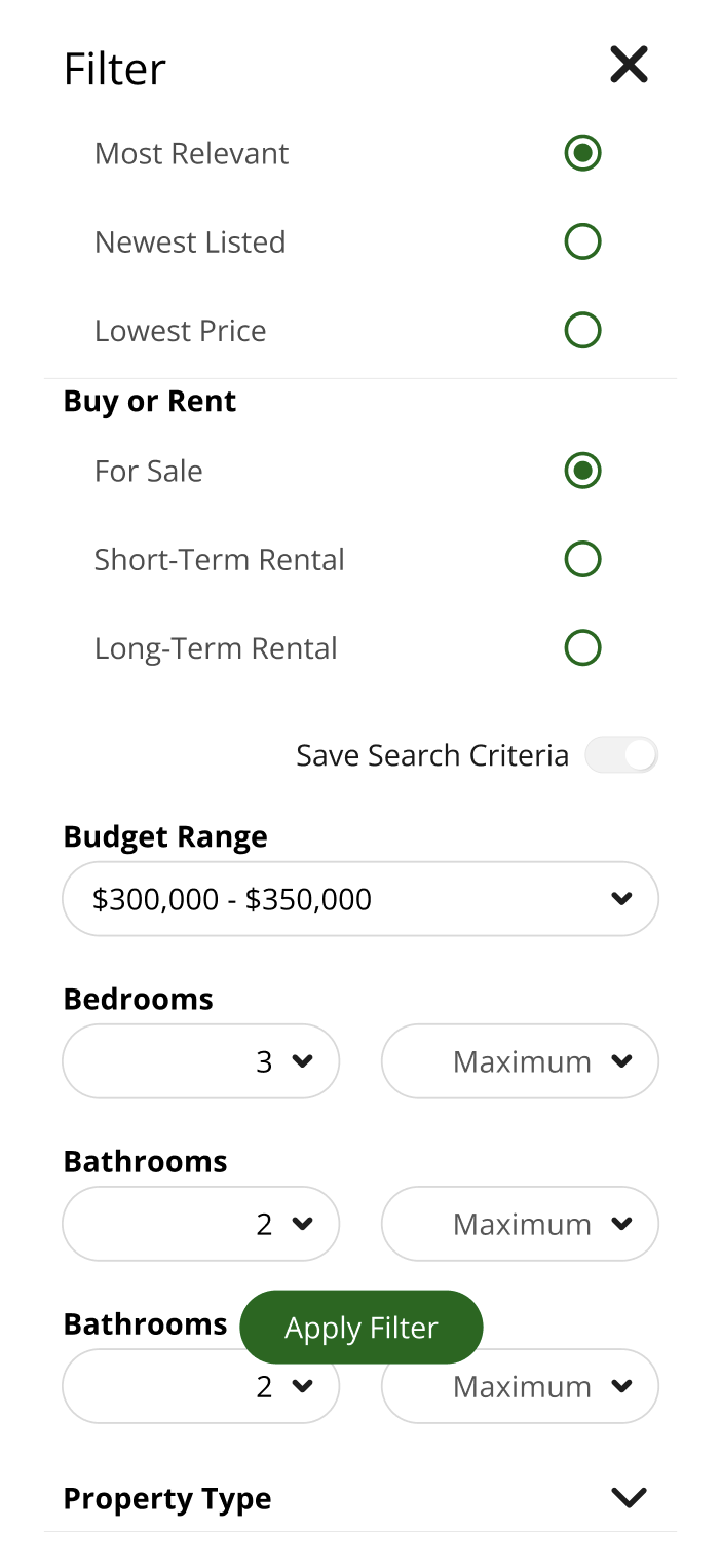
High-Fi Filter
-
![]()
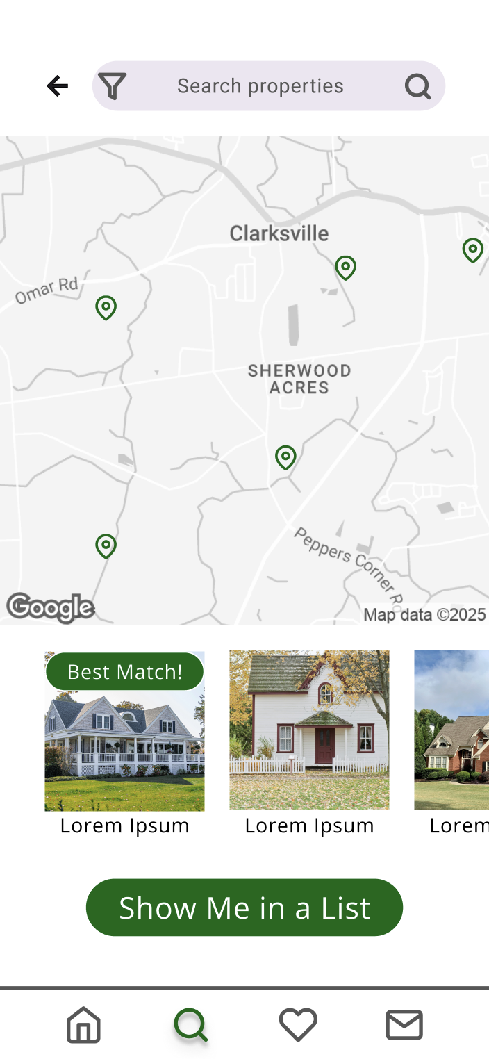
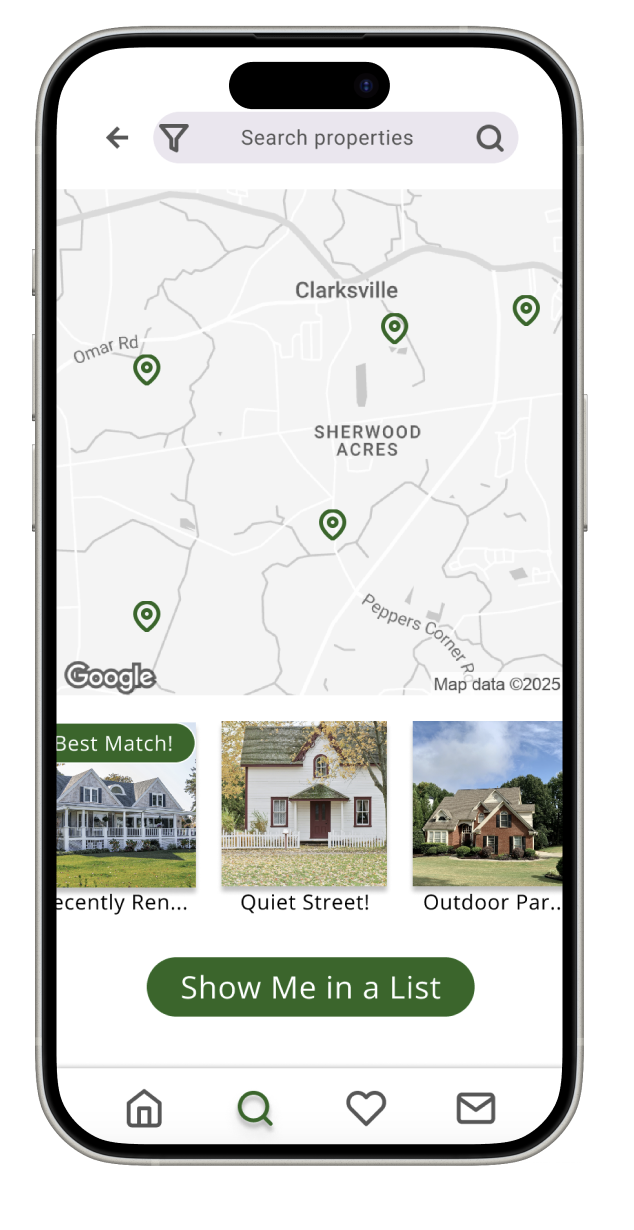
High-Fi Search Map
-
![]()
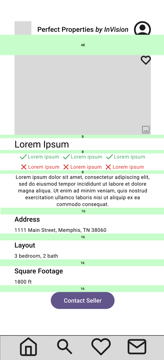
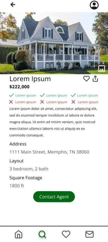
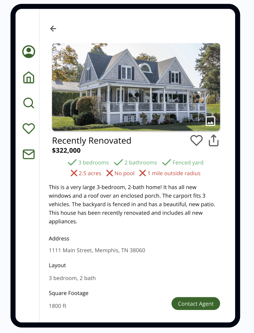
High-Fi View Property
-
![]()
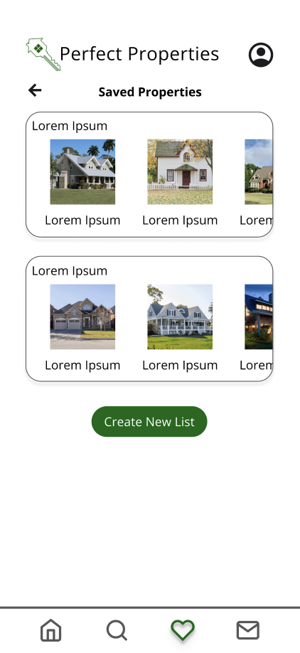
High-Fi Saved Properties

-
5 participants
4 women, 1 man
Age Range: 25-50
Tech-Savviness: Moderate to High
All are property owners
-
Assess the ease with which users can search for investment properties using the app.
Evaluate clarity and usefulness of real-time, personalized data.
Identify usability barriers in property assessment and saving features.
Understand emotional response and satisfaction using the app.
-
Assess how users set up their accounts.
Observe how users navigate the property search and filter tools.
Measure time-on-task and task success rate for key actions.
Identify pain points in accessing personalized data insights.
Gather qualitative feedback to improve UI design and feature hierarchy.
-
Remote Moderated Testing
Tools Used: Zoom, Figma prototype
Moderator guided participants through tasks, observed behavior, and captured real-time reactions.
In-Person Moderated Testing
Conducted in a controlled setting.
Screen recording with audio commentary.
Participants encouraged to think aloud.
Validate
Usability Tests
Users were asked to:
create an account
search for an investment property
apply filters
save a favorite property
view saved properties.
-
All users found the search tool intuitive and responsive.
All participants appreciated the number of potential filters.
P5 noted feeling unsure how to change saved search preferences.
-
“This feels so familiar. It would make searching for my next property so easy!” – P3
“The icons and filters are very clear, like I already know exactly where things are located.” – P2
“I love the logo!” – P1
“I really like that each property is named. It would easy to remember which is which.” – P1
-
“I’m not sure if I like the checks and X’s, but I don’t know what I’d do differently.” – P5
“I wish the filters were more interactive.” – P2
“I wish I could move the map.” – P4
-
P5 clicked on the account icon expecting see favorites.
P2 tried to un-favorite the listing but was unsuccessful.
P4 didn’t see the favorite feature until pointed out by the moderator.
Designing for Different Breakpoints
& Preference Tests
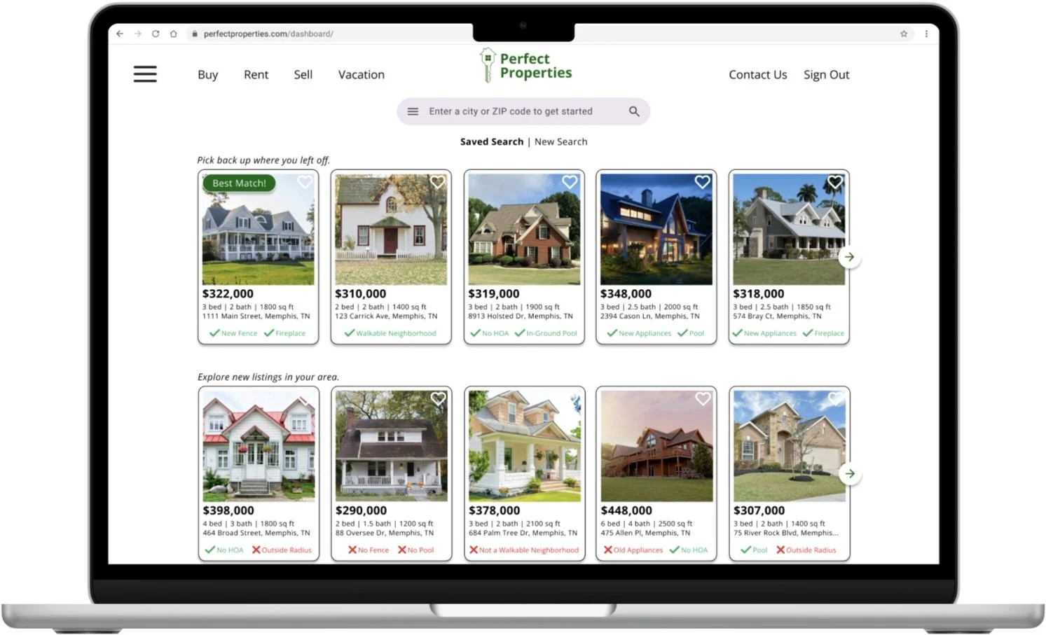
Option A - Tablet Dashboard
Option B - Tablet Dashboard
12 users were polled on their preferences for the Tablet Dashboard.
Option A included a green tab bar, and Option B included a white tab bar.
Results:
75% of participants preferred Option B with the white tab bar.
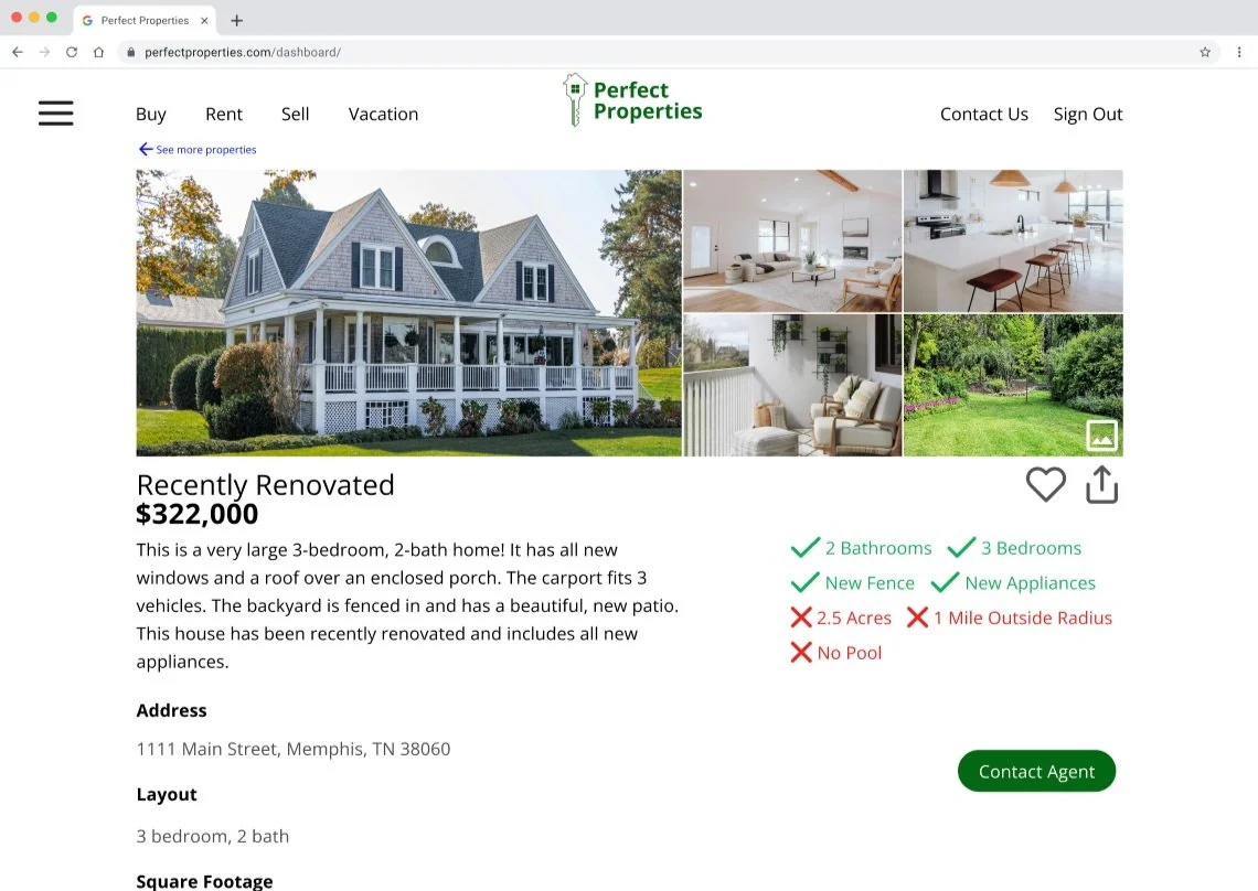
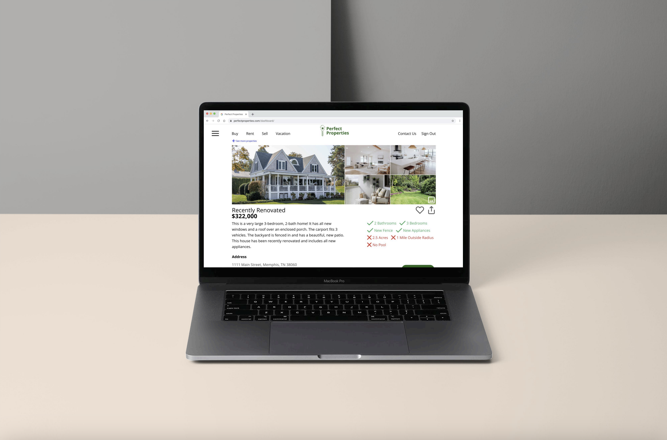
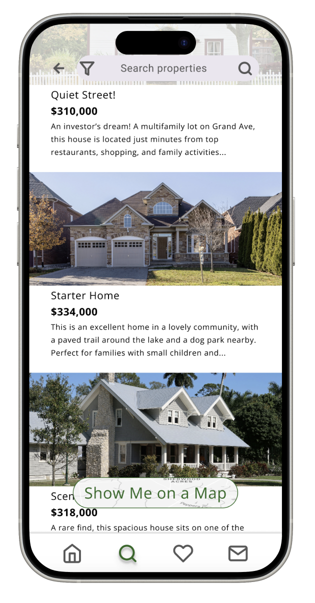
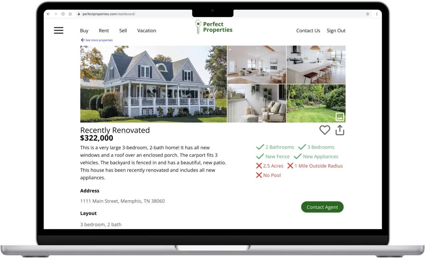
Option A - Desktop View Property
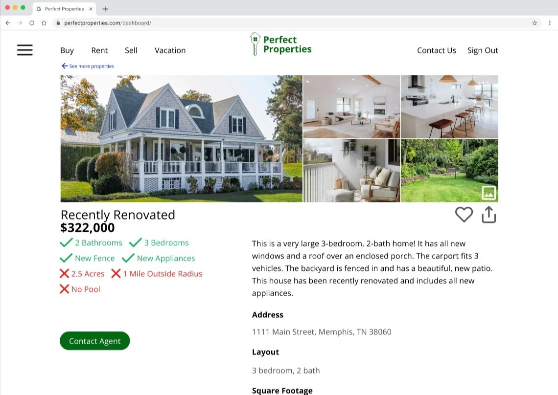
Option B - Desktop View Property
12 users were polled on their preferences for the Tablet Dashboard.
Option A listed the property details on the left and quick glance notes on the right, and Option B listed the quick glance notes on the left and property details on the right.
Results:
58% of participants preferred Option A with the property details on the left and quick glance notes on the right.
Iterate

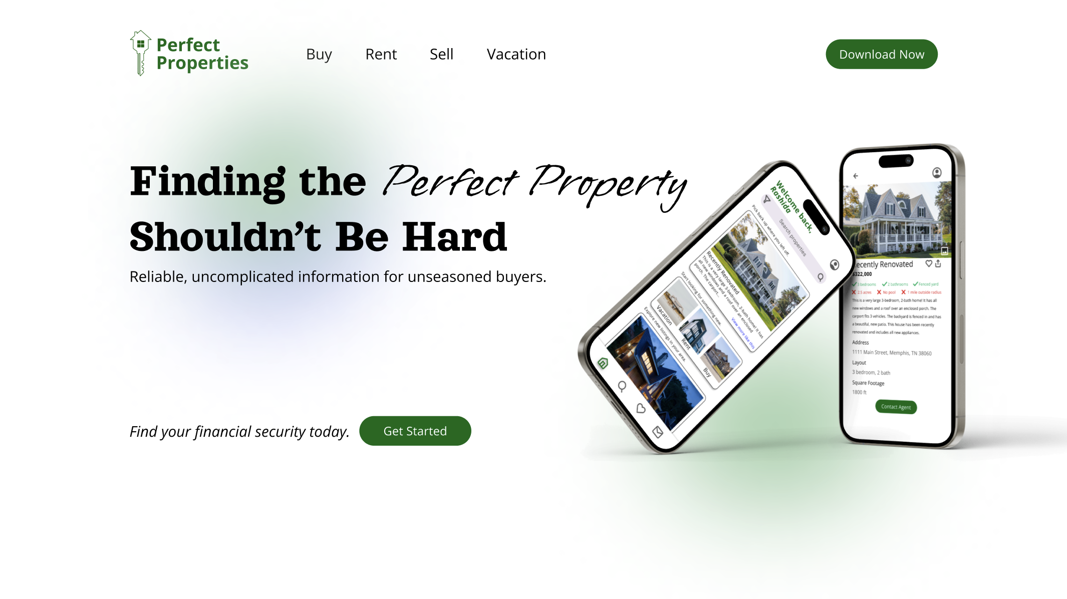
Current Design
〰️
Current Design 〰️

In Summary
Perfect Properties is the result of countless design iterations and deep user insights — an app I’m incredibly proud to showcase. Created for small-scale investors and first-time buyers, every feature was shaped by real user feedback, from effortless profile setup and personalized property filters to rich property insights and smart recommendations. I tested, refined, and reimagined every detail to ensure an intuitive, empowering experience. With bookmarking, seamless navigation, and direct access to real estate professionals, Perfect Properties delivers exactly what users need — right when they need it.
Next Steps
Next up for Perfect Properties, I’m building out features that take the experience to the next level — starting with a powerful property comparison tool so users can confidently weigh their options side by side. I’m also introducing custom alerts for listings in specific areas, keeping buyers in the loop the moment something matches their needs. I’m beyond excited to expand the platform with a dedicated interface for property sellers, giving them the tools to upload, manage, and market their listings with ease. These next steps bring Perfect Properties even closer to a truly end-to-end real estate solution.